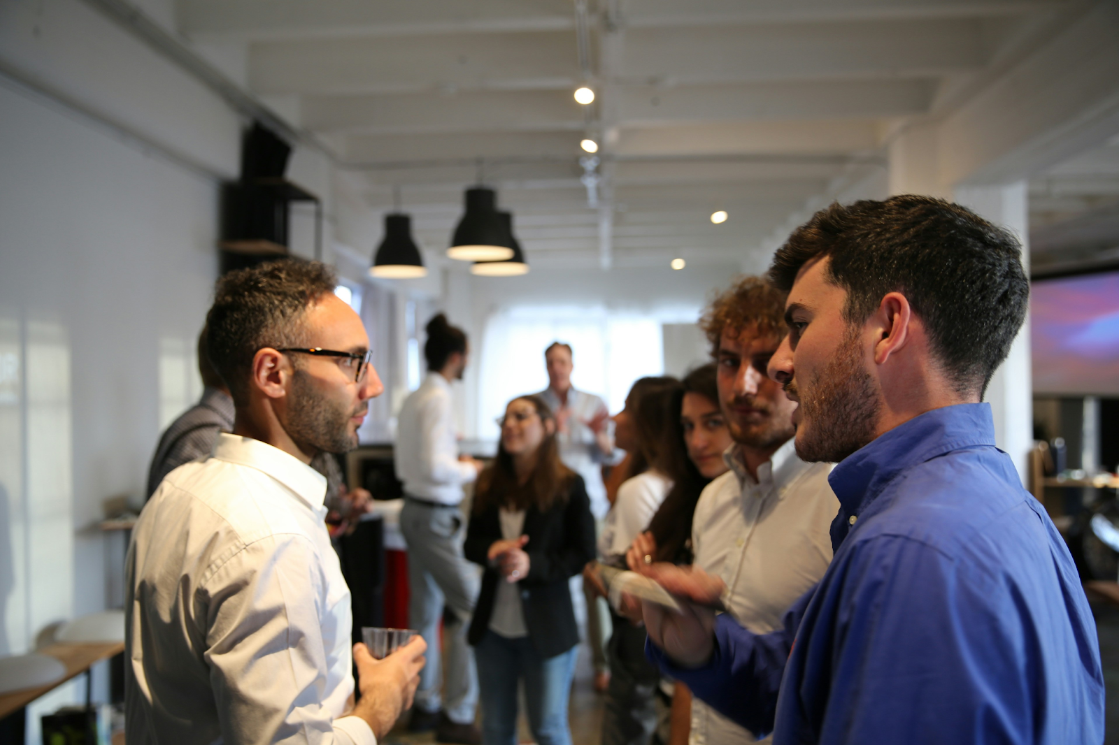
We have all been there. You are at a networking mixer, holding a lukewarm coffee, and you spot someone interesting. You approach them, extend your hand, and then... the awkward dance begins. You squint. You lean in uncomfortably close. You try to decipher the microscopic font on their chest without making it look like you are staring. The moment becomes tense, the flow is broken, and the connection starts on the wrong foot. In the events industry, we talk a lot about "networking ROI," but we often ignore the single most important tool that facilitates it: the name badge. It is not just a security pass; it is a license to converse. A well-designed badge removes social friction, while a poorly designed one creates barriers. If you want your event to buzz with conversation in 2026, you need to stop designing badges for databases and start designing them for humans. The number one sin of badge design is vanity. Organizers often prioritize a massive event logo or a complex background graphic, leaving the attendee's name as a tiny afterthought at the bottom. This is a mistake. The primary function of the badge is identification. Adhere to the "Three-Meter Rule." An attendee’s first name should be legible from three meters (about 10 feet) away. This allows people to recognize each other while walking down a hallway or standing in a circle, inviting a natural "Hey, Sarah!" rather than a hesitant wave. Use a clean, sans-serif font and bold it. If you have to sacrifice the size of your sponsor's logo to make the name bigger, do it. Your attendees will thank you with better engagement. Unless you are hosting a diplomatic summit or a military gathering, formalities are the enemy of networking. In a modern business context, we want to break down barriers, not reinforce them. Therefore, the visual hierarchy of your badge should reflect the social dynamic you want to create. The First Name should be the "hero" of the design—the largest and boldest element. It signals friendliness and approachability. The Last Name should be smaller, serving as a secondary identifier. The Company Name or Job Title should be legible but clearly subordinate. When you emphasize the first name, you subconsciously tell your attendees: "We are all peers here. Relax and talk." In a sea of hundreds or thousands of people, finding the "right" person to talk to can be overwhelming. A smart badge design acts as a visual navigation system. By using color-coding, you can help attendees filter the room at a glance. Use a colored strip at the bottom of the badge or a colored border to signify different categories: Investors (Green), Startups (Blue), Media (Red), or Speakers (Gold). This allows an attendee to scan a crowded room and immediately identify who aligns with their goals. It saves time and prevents that frustrating feeling of wandering aimlessly. Just ensure you provide a legend (perhaps on the back of the badge or in the app) so everyone knows what the colors represent. The hardest part of networking is the opening line. "So, what do you do?" is transactional and boring. Why not use the badge to spark a more human connection? Leave a blank space on the badge with a printed prompt, such as "Ask me about..." or "My superpower is..." or "Currently looking for...". When an attendee writes "Hiking" or "AI Ethics" or "A CTO," it gives others an instant, easy hook to start a conversation. It turns the badge from a static label into a dynamic storytelling tool. It’s a small design tweak that can fundamentally change the vibe of your networking sessions. You can have the best design in the world, but if the print quality is poor, the colors are washed out, or the material feels cheap, the effect is lost. The tactile quality of the badge reinforces the value of the person wearing it. This is where working with a dedicated specialist becomes essential. A provider likehttps://badgego.com/ understands the nuances of variable data printing and material selection. They can ensure that your carefully planned hierarchy translates perfectly onto the physical card, whether you choose sustainable wood, recycled PET, or premium laminate. Trusting a specialist ensures that your design intent isn't lost in production. Ultimately, a badge is a tool. Its job is to make the invisible visible and the difficult easy. By prioritizing legibility, hierarchy, and visual cues, you are doing the heavy lifting for your attendees. You are removing the anxiety of forgetting names and the awkwardness of introductions. You are creating an environment where connections happen faster and deeper. So, for your next event, look at your badge proof and ask yourself: Does this just say who they are, or does it invite the world to say hello?The Three-Meter Rule: Size Matters
Hierarchy of Information: First Name is King
Color-Coding: Finding Your Tribe
The Conversation Starter
Execution is Everything
The Badge as a Social Catalyst


Want to add a comment?