Creating a landing page that turns visitors into loyal customers requires a thoughtful mix of design, strategic messaging, and user-focused improvements. Success hinges on more than just good looks. You need to carefully consider how every element guides your visitors toward your desired action. For ideas and real-world examples of landing page design, exploring successful layouts can be a great place to start gathering inspiration and best practices.
A successful landing page is designed around a single goal, offers value upfront, and removes any barriers to conversion. It anticipates user concerns and addresses them directly through clear messaging and visual trust signals. Today’s consumers are savvy and expect both visual appeal and straightforward navigation. By following best practices grounded in both psychology and data-driven testing, you can craft pages that consistently outperform industry averages.
Whether your objective is to sell a product, capture leads, or book appointments, every aspect of your page should support that goal. From the headline to the call to action, coherence and clarity must be top priorities if you want high conversion rates and a strong return on investment.
Conversion-optimized landing pages utilize persuasive storytelling, high-quality media, and modern UX to deliver a seamless experience. Implement these strategies to turn casual visitors into committed customers.
Key Takeaways
Define a clear goal for your landing page to guide design and content decisions.
Craft a compelling value proposition that addresses your audience's needs.
Utilize high-quality visuals and social proof to build trust and engagement.
Optimize for cognitive ease and minimize friction to enhance user experience.
Implement A/B testing to continuously improve conversion rates.
Table of Contents
Define Your Goal
Craft a Strong Value Proposition
Create a Compelling Headline
Include High-Quality Visuals
Add Social Proof
Optimize for Cognitive Ease
Reduce Friction
Test and Troubleshoot
Define Your Goal
Before you get into designing or writing content, pick a single, specific objective for your landing page. This could be getting users to sign up for a webinar, download an e-book, buy a product, or schedule a demo. Each page should ask users to do only one thing. Defining your goal informs every subsequent decision, from copywriting and imagery to the placement of your call to action. This focus is essential because competing choices confuse users and dilute your conversion potential.
Craft a Strong Value Proposition
Your value proposition answers the user's core question: “What’s in it for me?” Make it obvious how your offer improves their life, solves a problem, or saves them resources. Back up your claims with specifics. For instance, if your app saves users time, quantify how many hours per week they can gain. Clear value propositions set you apart from competitors and quickly clarify why users should care.
Create a Compelling Headline
Your headline is the first thing visitors see, and it must immediately capture their interest. It should be concise, compelling, and clearly state the biggest benefit or solution you provide. Effective headlines speak directly to the user's needs. If you promise an actionable outcome or a transformation, make it front and center. Avoid fluff, vague statements, and jargon. Test multiple variations to see which resonates most with your target audience.
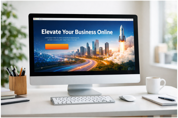
Include High-Quality Visuals
Images, graphics, or demo videos can dramatically boost engagement and comprehension. Visuals quickly explain complex concepts and help visitors visualize your offer. Use authentic imagery rather than generic stock photos. If possible, show real people using your product or service. Videos are especially effective for demonstrating features, establishing brand credibility, and breaking down barriers to action. Pay attention to file size and loading speed to avoid frustrating users, as experts at Smashing Magazine highlight.
Add Social Proof
Humans are wired to seek validation from others before making decisions. Include testimonials, star ratings, influencer endorsements, or industry certifications. Case studies or logos from recognizable clients further build credibility. Place social proof elements near your call to action, so when hesitation strikes, users see positive reinforcement from peers or authorities in your field.
Optimize for Cognitive Ease
User experience is crucial. Arrange information in a logical visual hierarchy with distinct headings, clear bullet points, and ample whitespace. Easy-to-read layouts help users quickly understand your offer. Navigation should be minimal, with a strong focus on the call to action. Simple typography and consistent color palettes further reduce cognitive load and keep attention focused.
Reduce Friction
Every extra form field or distracting link is a potential drop-off point for visitors. Streamline your lead-capture forms by asking only for what is absolutely necessary. Remove navigation menus and footer links that could divert users from the path you set for them. Optimize your site for fast page loads on both desktop and mobile. Clarity, speed, and simplicity increase the likelihood that users will complete your desired action.
Test and Troubleshoot
Continuous improvement is the key to high conversion rates. Use A/B testing tools to experiment with different headlines, images, forms, and call to actions. Monitor analytics to spot points where visitors are dropping off and refine your content or layout accordingly. Testing also helps identify new opportunities to better meet visitor expectations and can reveal surprising insights about your audience’s preferences.
Following these strategies will help you create landing pages that not only look great but truly perform. High-converting landing pages are built upon strong goals, clear value, persuasive visuals, and rigorous ongoing optimization. In a crowded marketplace, the best landing pages are those that truly put user experience first and evolve in response to real data.


Want to add a comment?