Navy is not about being dramatic. Navy adds layers, creates contrast, and delivers completion. Designers will use navy as an everyday tool rather than an occasion for bold discussion by 2026.
If you want a dramatic upgrade without remodeling, navy wallpaper can shift a space quickly. This guide covers patterns, room-by-room placement, color pairing, and installation choices that help the navy look intentional.
This color has proven to be a steadfast choice with homeowners. Navy creates the illusion of space without being sombre or overbearing, and can be combined with almost any decorating style.
It works like a modern neutral, matching wood, stone, leather, and both warm and cool palettes.
It adds visual drama while staying softer than black, so rooms feel layered, not heavy.
It suits many styles, from minimal to traditional, especially in matte finishes that hide small wall flaws.
Navy can read calm, tailored, or bold depending on the pattern and finish. Your best choice depends on the room’s light, your furniture style, and how much visual activity you want on the wall.
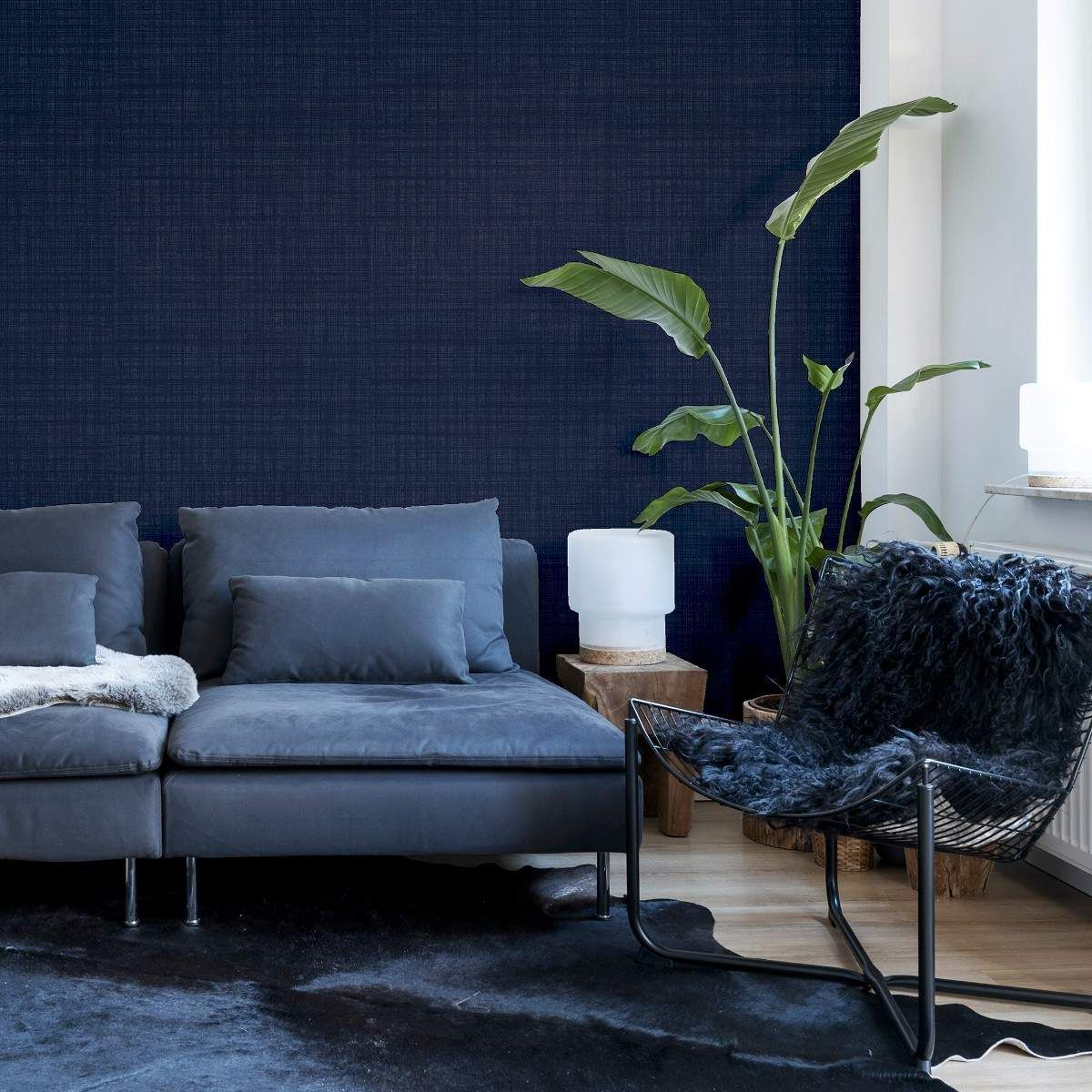
Solid navy works best when the finish adds depth. Linen-look texture, soft plaster effects, and tonal embossing keep the surface from feeling flat, especially under warm lamps. This option suits bedrooms and home offices where you want a steady, quiet backdrop.
Navy paired with warm metallics looks elevated fast. Navy and gold wallpaper works best with glare control, since shiny ink can catch harsh downlights. Use warm bulbs and repeat gold in just a few details, like a mirror frame or lamp base.
Navy with a white color scheme is a classic and feels fresh. Using strips, clean geometric shapes, and tailored patterns can add contrast to a space and make the room feel larger, ideal for smaller spaces. Consider a cream alternative to pure white for a softer appearance.
The marble-inspired navy is a clean and upper-class, yet calming shade. We recommend controlling the veining and adjusting the undertones to your hardware: cool stone with chrome or warm stone with brass. We recommend using it as a feature wall for a sideboard, bar area, or a large mirror.
You can achieve the Geometric navy look with a little more planning and less decorating. While bold, pointy geometric shapes can look sharp, rounded forms and low contrast grids are much calmer. A medium repeat works in most spaces, but you may want to consider a medium repeat with a sofa against a navy accent wall in the event you choose to keep the rest of the space neutral.
Botanicals soften the navy and make it feel more relaxed. Look for designs with breathing room and a limited palette, since dense foliage can feel heavy in tight spaces. Botanical prints pair beautifully with wood, cane, linen, and woven textures, which helps dark blue wallpaper feel warmer.
Navy looks best when you match the pattern and finish to how the room is used. Use this quick table to choose placement and lighting strategy.
Navy is flexible, but it looks best with a simple plan. Choose two supporting colors and one main material direction, then repeat them across the room.
Navy and gold wallpaper looks strongest with warm bulbs and a few brass accents, not a full set of shiny décor.
Natural wood tones soften navy and keep the room welcoming, especially with textured fabrics.
White and cream balance navy and help the space feel brighter, especially with white trim.
One accent color is enough. Try rust, olive, or dusty blush for controlled warmth.
Keep metals consistent. Pick one dominant finish and repeat it in two to three places.
Use textiles to carry lighter tones, so navy stays grounded instead of heavy.
Material choice affects durability, cleanability, and how forgiving installation feels. It also changes how the navy reads under different lighting.
Peel-and-stick navy wallpaper works best on smooth, clean walls with fully cured paint. It suits renters and quick refresh projects. Test a small patch first to check edge grip and paint compatibility.
Prepasted and paste-the-wall options tend to last longer and hold seams down better. They also offer more premium textures and richer finishes. If you plan long-term, traditional installation often delivers the cleanest result.
Navy can feel rich and cozy, but it needs thoughtful light. Use warm bulbs, add at least two light sources, and avoid bare downlights aimed at reflective finishes. Light rugs and curtains also help lift the overall balance.
Navy becomes easy to live with when you plan for scale, contrast, and the room’s natural light. Samples matter, since the navy can shift under different bulbs.
Small rooms often look best with simpler patterns and lighter supporting finishes. Large rooms can handle deeper tones, texture, and bigger repeats. If the room is narrow, keep the ceiling and trim lighter.
Let the navy be the main statement, then edit the rest. Limit competing patterns and repeat two or three tones across textiles. If you choose a strong print, keep upholstery solid.
Start with sellers who specialize in wallpaper, not general décor marketplaces. A focused wallpaper shop usually provides better finish descriptions, repeat information, and installation guidance. Brand-direct stores and established wallpaper retailers also tend to keep color consistency and publish reliable specs.


Want to add a comment?